
project details
Designer: arch. Marco Caruso, arch. Salvatore Contrafatto, arch. Diletta Impresario, arch. Maria Manuli, arch. Lucia Rapisarda, arch. Carmelo Ranno
Note:
FOUNDATION ORDER OF ARCHITECTS P. P. C. THE PROVINCE OF CATANIA LAD PROJECT A design workshop for the Hospital Pediatric Hematology and Oncology
INTRODUCTION
The project aims to change the structure in a minimally invasive Unit of Pediatric Oncology. The interventions provided in these particular environments are designed to improve the short or long stay of the patients, but at the same time favor the use of space by all users, so even the professionals and loved ones of young patients, who are still to live and spend time in the department. Therefore, the interlocutor of the project will not be unique but the intercept changes the interest of all those who have a history in common and share, albeit with different roles, those places.
Within the department, is the third to the fourth floor, the orientation is fundamental to living space itself. A perception of clear and immediate need, but to get to define and characterize the spaces are observed and mapped the movements and locations in an attempt to outline a method of analysis and return of critical guidance found.
Are distinct then 2 streams:
– Slow flow, for all those who have less than a month in the hospital, and then will move more in their rooms, hallways, and classrooms that need and curiosity to discover all the spaces the department;
– A rapid stream, the day hospital, and for those who wait, those that move through the corridors and clinics, including waiting rooms, lobby and rooms, are the children, but parents and staff.
Then there are the retail spaces on both floors of the lobby, which is crossed every day by people, especially professionals, who do not stop, so space is a space of transit, anonymous, and characterized by the speed , must not, therefore, do more than indicate a direction. Another part of the hall, but is enjoyed by those who stop, then stop by the patients and their relatives awaiting the visit, it is slower then a space which must be thorough, it must be designed to accommodate.
Addition of the main nodes are identified, they are nodes of differentiation and sorting of the paths, which become the crucial points of focus for the placement of the elements indicators, for the distinction of the spaces through the separator elements, as well as to facilitate the user the perception of the same through the use of color as an identifier of an area or function. From these nodes start at different locations, depending on whether the user or staff, or the second direction.
Once completed the analysis of cognitive trails on the study area, which has allowed to highlight the various critical points have been established, some project proposals aimed at improving use of color, correct, explicit spatial orientation. For this purpose it was sought to the installation of elements of graphic signs in correspondence of the critical points and placement of various elements of separation that better define the spaces, making them more comfortable to the human measure and, in addition to having a strictly practical in the shield each other environments.
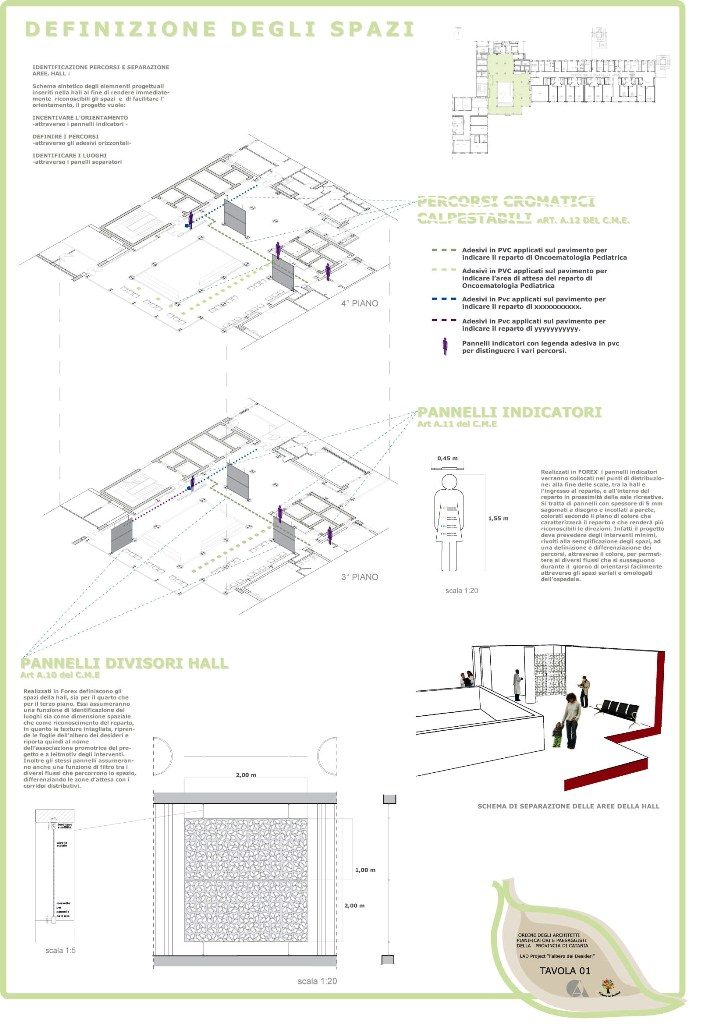
DEFINITION OF SPACE
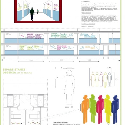
PANELS PARTITIONS HALL (vd article A.10 of cme, pl. 1)
The spaces of the lobby, which is the fourth to the third floor, will be defined through the separator panels.
They assume a function of identification of sites and as a spatial dimension in recognition of the department, as the carved textures, takes the leaves of the tree of wishes and then returns the name of the association sponsoring the project and leitmotif of the interventions. As these panels take also a function of filter between the different streams that run through the space, differentiating the waiting areas with corridors distribution.
The material used for the panels is the forex: these plates PVC semi-expanded closed cell. The use of this material has great advantages:
– It is a flame retardant (Class 1 certificate for all thicknesses);
– Resistant to water, cold weather, acids and corrosive;
– Robust: excellent resistance to shock, he rails;
– Waterproof: no water absorption or moisture, thermal, acoustic and electric heaters, rot, mildew-antibacterials.
Moreover from the aesthetic point of view of its function and has an excellent appearance semi-opaque, is printable and superlight and lends itself to be easily cleaned and possibly colored.
Each panel will consist of two pieces (200X100 cm, a thickness of 3mm) and will be installed on site easily and quickly through a system of rods and clamps of steel.
In addition, given the particularities of the department, were chosen this type of panels, also for their high cleanability. In fact, for the cleaning of surfaces made of forex is sufficient plain water or with addition of a mild detergent product.
Like all plastics, even the FOREX may be subject to electrostatic charges that cause the deposit of dust and dirt. For which, in the case of environments in which it requires great attention to this aspect, it is possible to eliminate this phenomenon with the appropriate treatment and in particular with the use of antistatic agents which delay considerably the subsequent accumulation of dust. They are liquids in aqueous or alcoholic solution forming on the surface of the panels an antistatic coating. Take this by dipping, spraying or washing the plates with a white cloth soaked in the product. The antistatic effect occurs as soon as the liquid of the solution is evaporated.
COLOR AS A PLACE OF IDENTIFIER
PANEL INDICATORS (vd A. Article 11 of the cme, pl. 1)
FOREX is the same used for marker boards that will be placed at points of distribution: the bottom of the stairs between the lobby and the entrance to the ward, and within the department in the vicinity of the recreation rooms.
It is panels with a thickness of5 mmshaped design and glued to the wall, colored according to the plane of color that will characterize the department and make it more recognizable directions. In fact, the project must provide the minimal intervention, aimed at the simplification of the spaces, a definition and differentiation pathways, through color, to allow different flows that take place during the day to navigate easily through the serial spaces and approved hospital . It ‘a communication strategy based on the places of design interventions aiming to stimulate the senses at least for those who enjoy more space, and especially the view with color, which means the adhesive on the floor and wall will be present in all spaces object of the project.
CHROMATIC HORIZONTAL PATH, WALK STICKERS (vd article A.12 of cme, pl. 1),
Once at the hall, the orientation will be facilitated by adhesive PVC seats to the floor that accompany both the resident and the family physicians toward different paths between them. Depending on the symbol on the ground in the average width of10 cm. you will find: the path to the waiting room, one that accompanies the resident to the department and a fast track that switches to the other spaces. The symbols provided is of invention, the nodes of the main sorting are identified by the circles, from which branch off and then the different paths characterized by color and by a hatch more or less dense depending on the type of route. In this way the color as well as the sign becomes a guide sign officer.
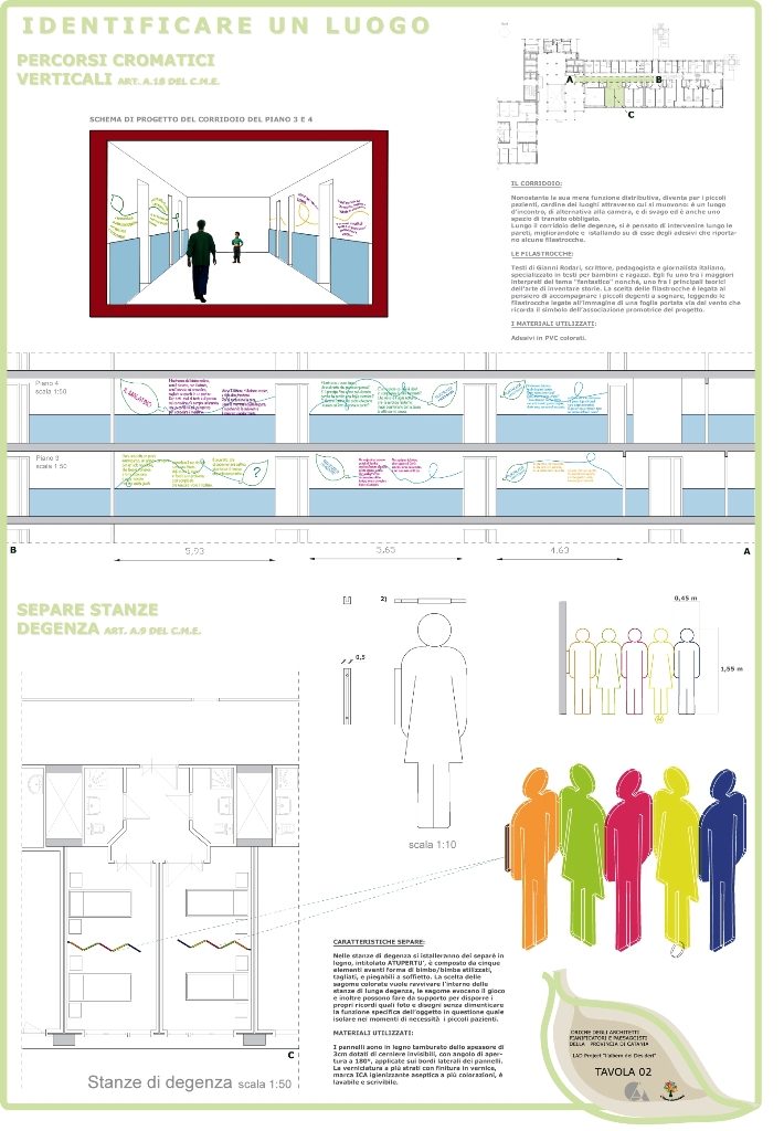
CHROMATIC VERTICAL PATH, NURSERY RHYMES (vd article A.18 of cme, pl. 2),
Looking at the rooms of the hospital, it is clear that the corridor, despite its mere distribution function, becomes for the young patients, the linchpin of the places through which they move is a meeting place, an alternative to the room, and recreation and is also a transit space required. For this reason along the corridor of stay, it was decided to take action along the walls, improving them and installing them on the PVC stickers that bear some rhymes Rodari, writer, educator and an Italian journalist, specializing in books for children and teens . He was one of the greatest interpreters of the theme “fantastic” and, one of the leading theorists of the art of inventing stories. The choice of nursery rhymes is tied to the thought of accompanying the young patients on dreaming, reading nursery rhymes related to the image of a leaf blown away by the wind that recalls the symbol of the association sponsoring the project.
PLACES TO LIVE
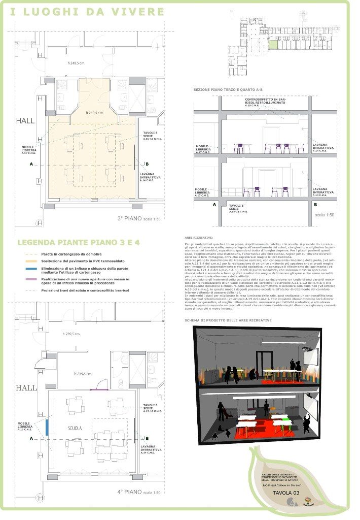
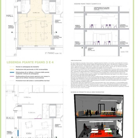
Recreated SPACES IN THE THIRD AND FOURTH FLOOR (vd pi. 3)
For environments in the fourth and third floors, respectively, the studio and the school is expected to re-create the space, through choices, always linked to the assortment of colors, which serve and improve the permanence of children, especially when it comes of long-term care. For younger patients these spaces, are a distraction, the alternative to their room, so that they must diversify their image, as well as to better fulfill their function.
Early interventions and involves a structural arrangement: the third floor the demolition of the central partition, resulting in the removal of doors, (vd Article A.21.1.4 the cme) for the realization of one more space that lends itself better to time for learning and school activities, it follows the resurfacing of the floor (vd A. Article 121.1.6 of cme and A. 1) in heat-sealed PVC sheeting, which will be put in place in patterns with different colors and creative graphics that best define and the spaces that are versatile for a possible alternation of the activities.
The fourth floor interventions on the structure of the room are: a cut of a part of the masonry for the realization of a compartment of access from the corridor (vd article A.21.1.1.2 of cme); and the consequent removal and closing of the door allow access only from the lobby (vd article A.19 of cme), so the patients can access directly from the atelier interior corridor bypassing the lobby.
In both plans to improve the luminous efficiency of salt, will be stretched like a false ceiling made Barrisol backlit (vd cme of Article A.19). This lighting system will be sized to provide, at best, the illumination necessary for the business school, and at the same time it is thought the second game of volumes that make the environment more dynamic and playful, creating areas of light or dark .
The furnishings included are designed with the same criteria of dynamism:
– Ergonomic chairs, stackable and easy to clean polypropylene dyed;
– Tables (A. vd Article 15 and 16 of cme), with a very flexible form, since their cuts allow the combination of multiple modules, thus encouraging moments of group work and social life;
– The mobile library (vd cme of Article A.17), partly enclosed by lockable doors, partly open to accommodate the materials. The furniture formed from modular elements are made of melamine termostrutturato, are resistant to all types of shock, scratch, stain and abrasion and very low formaldehyde emission, given the type of user.
Furthermore, to encourage innovation and learning, it involves the insertion of two interactive whiteboards (vd article A.14 of cme), it uses interactive lessons more engaging for children and allow us to understand more quickly. By exploiting the language of images and movies, the lessons become more challenging and at the same time, teachers can still apply the traditional methods of teaching in an innovative way.
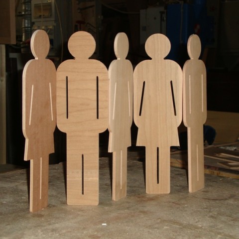
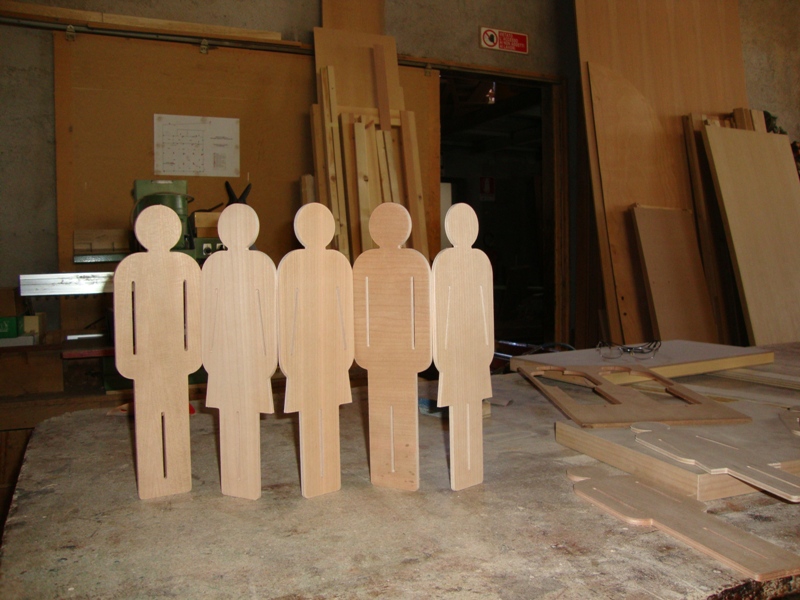
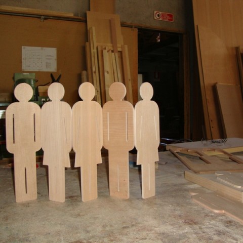
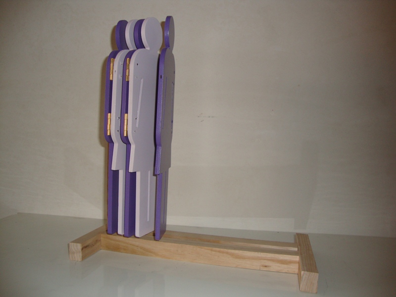
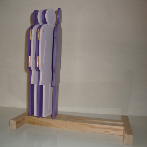
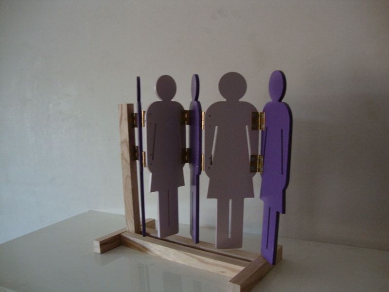
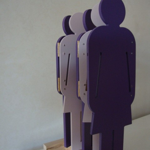
Separè PATIENT (A. vd Article 9, pi. 3)
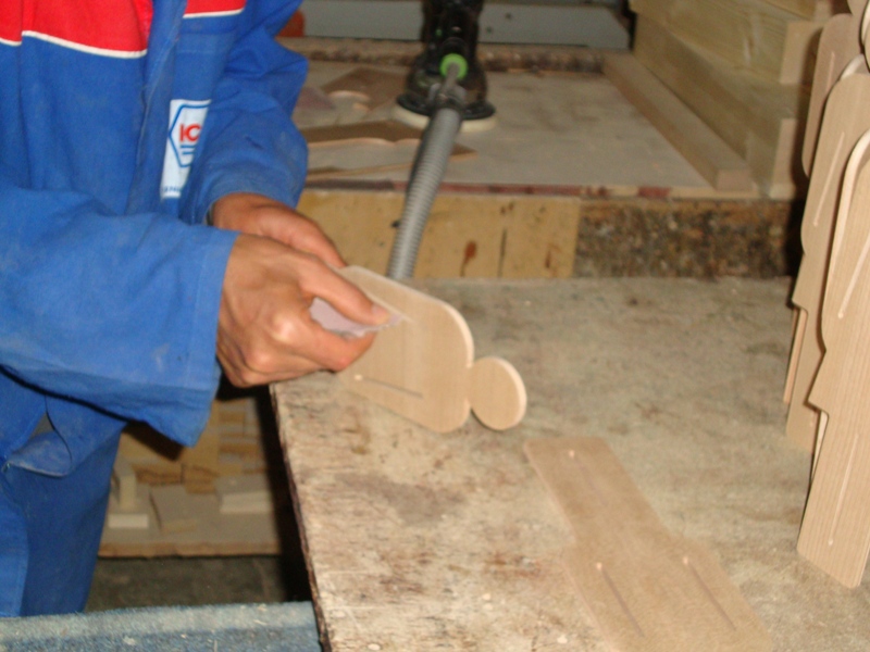
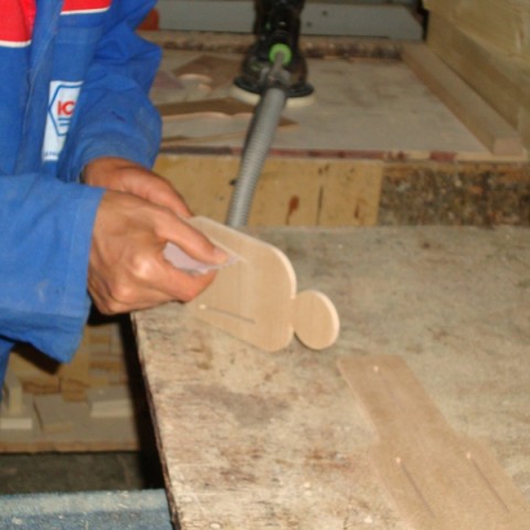
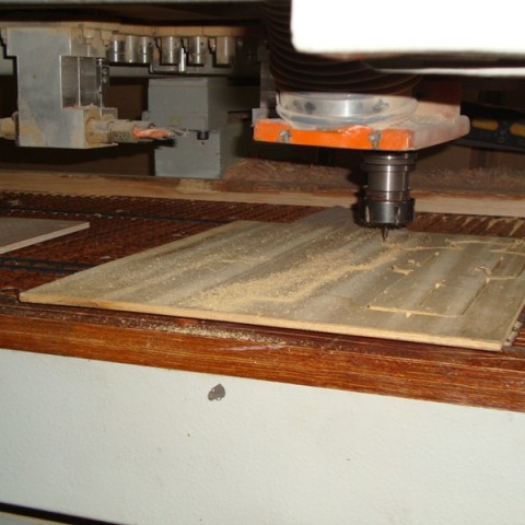
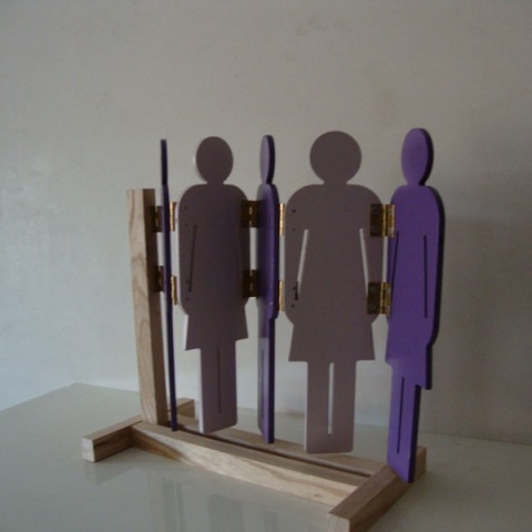
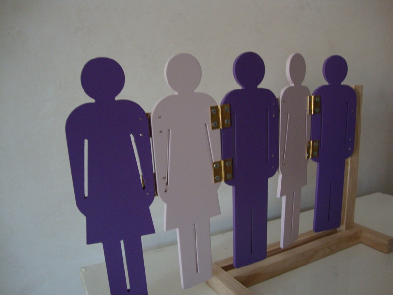
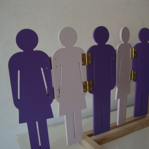
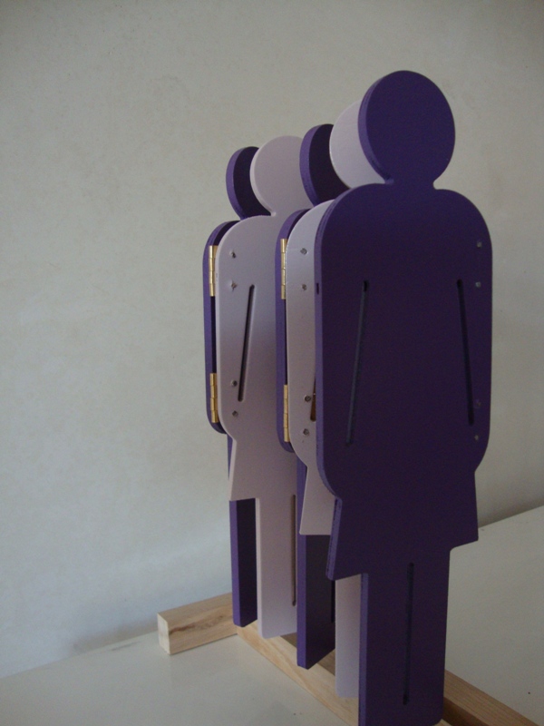
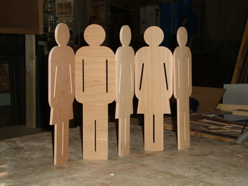
The booth titled ATUPERTU ‘, consists of five elements which have shaped boy / girl stylized, cut, and a folding bellows dimensions: length (open)256 cmheight (excluding wheels) 156cm, 3cm thickness of the elements. The panels are in wood sandwich thickness of 3cm equipped with invisible hinges, with an opening angle of 180 °, applied on the side edges of the panels. The multi-layer coating with paint finish, Brand ICA sanitizing Aseptica multiple colors, is washable and writable. The Wall mount is via strip beech 4×4 cm. The wheel of thermoplastic rubber with swivel castors fixed in the bottom edge of the penultimate panel allows an easy mangevolezza and use of the booth (vd prototype).
The choice of colored shapes wants to rekindle the inner rooms of the long-term care, the silhouettes evoke the game and can also act as a support to have their memories such as photos and drawings not to mention the specific function of the object in question as to isolate the moments necessity of the young patients.
In this way, the purposes strictly technical panel is played down by the playfulness of the object, the surface of which can be customized through drawings and the silhouette of which reports to environments fun and comfortable.
CONCLUSIONS
All interventions are designed in a logic of continuous transformation of space, so the materials and elements are provided as a common denominator of the simplicity of implementation, maintenance and eventual transformation and removal without damaging the structure of functional sites.